
7 Inspiring Auto Shops Logos to Drive Your Brand
A driver spots your shop sign at 40 miles per hour, later sees your logo again on a Google listing, then finds it on an estimate in their inbox. If those three versions do not feel like the same business, trust drops before anyone asks about pricing.
Your logo needs to do more than look polished on a mockup. It has to stay clear on a truck door, readable on uniforms, sharp on a website, and identifiable on small-format items like invoices and digital estimates. Shop owners usually notice the problem too late. A mark that looks detailed and aggressive on a designer's screen often turns muddy on a storefront, disappears in embroidery, or turns generic at mobile size.
That is why restraint usually wins. Analysts reviewing the 250 largest global companies found that 81.6% of logos use two or fewer colors, and blue appears in 30.8% of those logos. Big brands are not automatically smarter than local shops, but they do test for recognition, reproduction, and consistency at scale. The same practical rules apply to an auto shop logo.
The examples below are useful for more than inspiration. Each one shows why a logo works in real shop conditions, what trade-offs come with the style, and what you can borrow if you are sketching ideas yourself or giving direction to a designer.
Table of Contents
- 1. Amberd Design Studio
- 2. blueunderground
- 3. Hyer Studios
- 4. Designer Murat Automotive Logo Design
- 5. Bdazzil Marketing Automotive Branding
- 6. C3 Media
- 7. Vercetti Design
- Top 7 Auto Shop Logo Designers Compared
- Turn Your Logo Idea into a Powerful Brand Asset
1. Amberd Design Studio
![]()
A customer sees your truck in traffic, your estimate at the counter, and your site later that night. If the logo shifts personality across those touchpoints, the brand loses credibility fast.
stands out because the work shown is applied, not isolated. The portfolio does not stop at a logo on a clean mockup. It carries the identity into print pieces, apparel, and web assets, which is where many auto shops logos either hold together or start to break apart.
That practical range matters for repair businesses. A mark can look sharp in a presentation and still fail once it is stitched on a shirt, printed on a service invoice, or scaled up on an exterior sign. Amberd appears to design with those conditions in mind, which makes this a stronger fit for owners who need a usable brand system, not just a badge.
Why it works in a shop setting
The main strength here is consistency. The visual language stays recognizable across the places customers interact with the business. That is the standard I look for first, because familiarity is built through repetition in real operating materials, not through one polished logo file.
Auto repair branding also has to do two jobs at once. It needs to signal competence and stay easy to read at a glance. Guidance from supports that same principle, especially the need for clarity and versatility across signage, print, and digital use.
Practical rule: If a designer cannot show the logo on uniforms, invoices, and signage, you are still judging concept work, not business-ready branding.
A few trade-offs come with this kind of studio model:
- Better brand control: One team handling logo, collateral, and web assets usually reduces inconsistency between vendors.
- Custom pricing: Budget clarity may come later in the process because there is no public package structure.
- Capacity limits: Boutique studios often give close attention, but timing can tighten if you need fast revisions or a larger rollout.
For a shop owner, the takeaway is simple. Amberd is a good option if the goal is a logo that survives contact with daily operations and keeps the same identity on the truck door, the invoice, and the website.
2. blueunderground
![]()
builds around a constraint many shop owners know well. A logo has to hold up on a road sign at 40 mph, on a work shirt across the counter, and in a tiny website header on a phone. The work shown here points to that kind of discipline.
What stands out is restraint. The identity work avoids the usual pileup of checkered flags, flames, and overworked car outlines. That matters because auto shops logos often fail from trying to say too much at once. For a repair business, clear letterforms and a distinct shape usually do more for recall than another generic wrench icon.
Best fit
blueunderground makes sense for owners who want to look specialized and established without drifting into cliché. That is especially useful for shops serving a narrower market, such as import repair, performance work, or a single vehicle category, where the brand should signal focus without becoming busy.
The practical lesson is simple. Distinctive branding tends to work best when the mark is clear, consistent, and applied across every customer touchpoint. A logo does not create trust by itself, but it can support trust when the same identity shows up on the building, the estimate, the service reminder, and the site.
Test the logo small, far away, and in one color before approving it.
That process reveals the true trade-offs.
- Built for long-term use: A restrained mark usually dates better than trend-driven automotive graphics.
- Better fit for multi-use branding: Owners who need signage, print pieces, and web graphics to feel like one system will likely value this approach.
- Less suited to rush jobs: A smaller specialist studio may be a slower fit if the priority is speed over refinement.
3. Hyer Studios
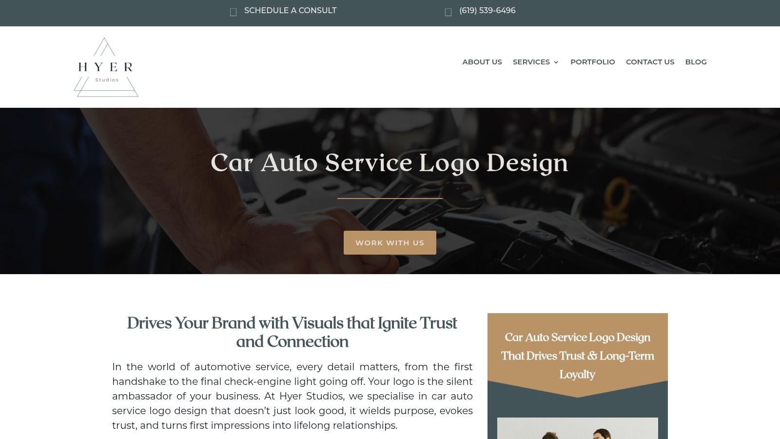
A customer is standing at your counter after a breakdown, glancing from your sign to your estimate and then to your website on their phone. In that moment, your logo is doing real work. It needs to look credible fast. stands out because its automotive branding pitch centers on trust, symbolism, and perception, not just style.
That focus fits repair shops well. Auto shops logos are not fashion marks. They need to reduce doubt, hold up on a truck door, stay readable on an invoice, and still look sharp in a mobile booking flow. Hyer appears to understand that broader job.
Where this approach helps most
Hyer is a good fit for shops that have solid operations but an uneven public image. That usually shows up as a generic sign, dated website visuals, or branding that feels louder than the actual customer experience. A more deliberate symbol can signal reliability, precision, or professionalism without falling into the usual automotive clichés.
There is also a practical digital point here. LogoDesign.net argues that many auto repair logos still are not built with mobile use in mind, which matches what many shop owners see in practice when marks blur inside scheduling tools, approval screens, and small website headers. A mark that only looks good on a storefront sign is limiting.
- Strong trust positioning: Useful for shops that win business through reassurance, clarity, and a polished front-of-house experience.
- Better cross-channel potential: A simpler, symbol-led system is more likely to work across signage, digital touchpoints, uniforms, and printed paperwork.
- Less visible automotive proof: Public examples appear lighter than firms with a larger published portfolio in this niche.
The trade-off is straightforward. A trust-led identity usually requires more discipline in execution. If the logo is refined but the estimate sheet, service reminders, and counter signage still look disconnected, the brand will feel unfinished. Owners considering Hyer should judge the work as a system, not as a standalone badge.
4. Designer Murat Automotive Logo Design
![]()
is the most direct specialist option on this list. It speaks to mechanics, tuning garages, dealerships, and mobile service businesses in clear industry language. That's useful when a shop owner wants fewer layers between the decision-maker and the designer.
The appeal here is speed of communication. A solo designer or small design practice can often translate feedback faster than a larger team with multiple handoffs. For an owner who already knows the desired direction, that can make the process more efficient.
Trade-offs to understand
The benefit of direct access is also the limitation. Capacity is narrower, and the process usually depends heavily on the owner providing clean feedback. That works well when the business already has a clear identity. It works less well when the shop still needs help defining its brand position.
An important principle from auto repair branding is that the color scheme, imagery, and font have to pair directly with the shop's personality, service type, and growth goals, and designers should verify uniqueness rather than drifting toward copycat visuals. That's where a focused designer can do excellent work, provided the brief is sharp.
A specialist designer is a smart buy when the shop owner knows the brand voice. It's a risk when the owner only knows they “want something cool.”
A few clear pros and cons:
- Good niche alignment: The service language fits automotive businesses better than broad freelance marketplaces.
- Faster coordination: One-to-one feedback loops can be efficient.
- Less strategic depth by default: Owners may need to bring more clarity on positioning, audience, and rollout needs.
This is a sensible route for a single-location shop that wants custom work without committing to a larger branding engagement.
5. Bdazzil Marketing Automotive Branding
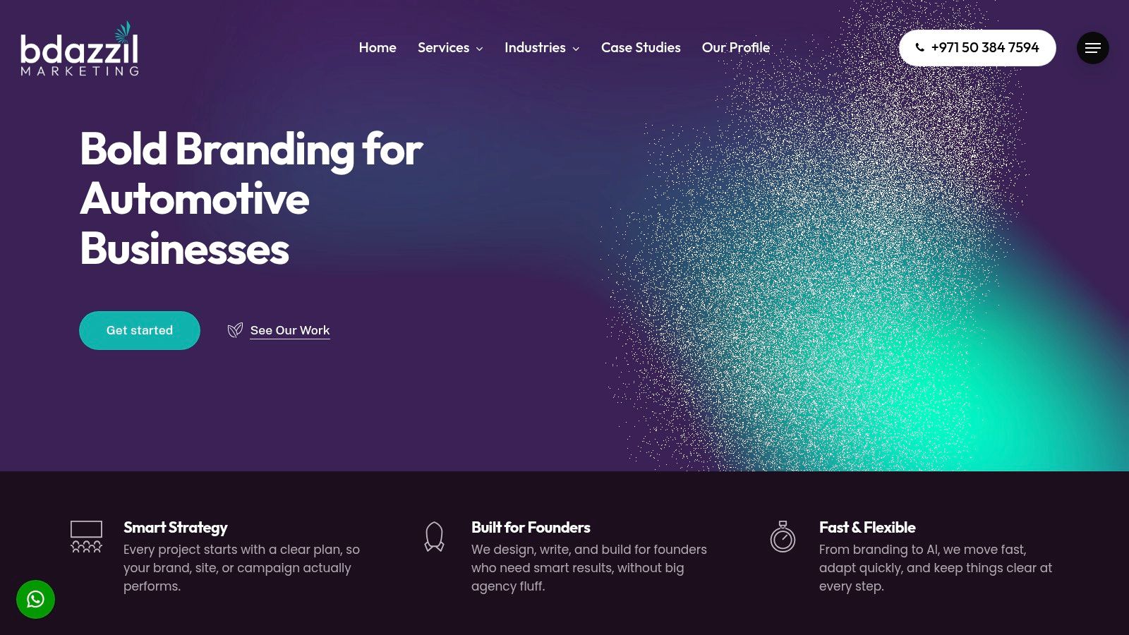
is the best fit here for owners who don't see the logo as a standalone asset. The positioning points toward strategy, identity systems, usage rules, and marketing alignment. That's what growing operations usually need.
A logo alone won't fix an inconsistent brand. If the website tone, signage, uniforms, and ads all look unrelated, customer trust gets diluted. Bdazzil appears built for shops that want one identity system used by several people across multiple touchpoints.
What stands out
The strongest value is documentation. Brand guidelines may sound corporate, but they solve real problems in a repair business. They stop vendors from guessing at colors, stretching the logo, or swapping fonts every time a new postcard, landing page, or sign gets produced.
That discipline lines up with a larger branding principle. Modern auto repair branding should be built on the shop's purpose, values, customer profile, repeat purchase behavior, and revenue patterns, while website analytics such as organic and direct visit growth help measure whether the branding works. Shops that plan to scale need that level of structure.
- Best for growth: Useful for multi-location groups or ambitious independents.
- Better consistency control: Guidelines help internal teams and outside vendors stay aligned.
- Possibly too much for a simple need: If the only goal is a single logo mark, this may be more engagement than necessary.
There's a hard business distinction here. Shops buying a logo are solving a design problem. Shops buying a brand system are solving an operational consistency problem. Bdazzil leans toward the second category.
6. C3 Media
![]()
A performance shop has different logo demands than a general repair garage. The mark still has to read fast on a truck door and invoice, but it also needs the sharper edge that import and enthusiast customers expect. stands out because its featured work appears built with that balance in mind.
The strongest signal here is system thinking. Instead of relying on one polished logo mockup, the identity appears structured to work in several formats. That matters in practice, where a shop may need a full lockup for the website header, a simplified mark for social profiles, and a compact version for shirts, stickers, or service paperwork.
For owners, that is the practical takeaway. A good auto shop logo is not just a nice badge on a black background. It needs to stay recognizable when embroidered small, printed in one color, or slapped on the side of a parts runner.
Distinctive means easy to recognize at a glance and easy to reproduce without losing its shape.
C3's style looks especially suited to shops selling a specialty. European repair, tuning, performance, and niche import work often benefit from a more deliberate visual tone. The trade-off is that this approach can skew too aggressive if the business depends on broad family-car traffic and wants to project warmth first.
A few practical notes:
- Best for specialist positioning: Strong fit for performance, import, and enthusiast-oriented shops.
- Useful across formats: The logo approach appears more likely to hold up on decals, apparel, headers, and documents.
- Ask about application range: Public examples look promising, but owners should still confirm how the identity performs in everyday shop materials, not just portfolio mockups.
7. Vercetti Design
A shop owner pricing out a logo usually has the same problem. The portfolio looks good, but the actual investment stays fuzzy until after the inquiry. Vercetti Design stands out because the package structure is public, which makes it easier to judge fit before spending time on calls.
That clarity matters for small and mid-sized repair shops. Branding competes with lifts, diagnostic tools, payroll, uniforms, and sign updates. If pricing is hidden, owners either delay the project or compare options on guesswork.
Vercetti appears best suited to shops that want professional design without agency-level process or cost. The public pricing for the Marshall Motors example starts at $750 for Basic and $1,250 for Standard, giving owners a concrete baseline as noted earlier in the article. That helps with a real-world decision most logo roundups skip: whether the budget should cover only the mark, or the supporting pieces needed to use it properly across shirts, paperwork, signage, and a website.
The practical upside is predictability. A defined package reduces back-and-forth and helps owners brief the designer more clearly. The trade-off is scale. If a business needs a full identity system with multiple sub-brands, rollout support, detailed signage standards, and coordination across many locations, a solo provider can be more limited than a larger studio.
The style fit also matters. For an independent shop trying to replace dated flames, wrenches, or generic clip-art with something cleaner and more credible, this approach makes sense. A more straightforward logo system often does a better job on estimates, service reminders, and truck doors than an overworked concept that only looks good in a portfolio mockup.
This also aligns with a pattern seen across automotive repair branding examples on Adobe Stock, where shops often use cleaner, trust-oriented visual cues instead of novelty graphics.
- Clear starting prices: Easier to budget before outreach.
- Good fit for independents: Useful for shops that want professional help without a large engagement.
- Know the ceiling: Best for simpler branding needs, not the most complex multi-asset rollouts.
Top 7 Auto Shop Logo Designers Compared
| Provider | Implementation Complexity 🔄 | Resource Requirements ⚡ | Expected Outcomes ⭐📊 | Ideal Use Cases 💡 | Key Advantages ⭐ |
|---|---|---|---|---|---|
| Amberd Design Studio | Medium–High: custom end-to-end delivery and coordination | Moderate–High: boutique fees, production for physical collateral | High-quality cohesive brand across signage, apparel and web 📊 | Shops needing a unified brand that extends to RedAppy-hosted site | Proven auto-body portfolio; production-minded deliverables |
| blueunderground | Medium: strategic logo systems and style-guide work | Moderate–High: specialist engagement, custom proposals | Durable, highly legible marks fit for print and signage 📊 | Shops prioritizing legibility, longevity and functional branding | Focus on functional attributes and European niche expertise |
| Hyer Studios | Low–Medium: symbol-driven, shop-aware process | Moderate: discovery-led, focused deliverables | Trust-oriented logos adaptable from storefront to mobile 📊 | Shops aiming to influence customer psychology at drop-off/pick-up | Clear automotive brand cues; emphasis on emotional trust |
| Designer Murat | Low: direct one-to-one designer workflow | Low–Moderate: solo capacity enables faster coordination | Precision-focused, tailored logos with quick iterations 📊 | Owners who prefer direct collaboration with a single designer | Automotive-specific vocabulary; efficient designer access |
| Bdazzil Marketing | High: strategy through identity and roll-out with measurement | High: multi-disciplinary team, documentation and implementation | Strategic, measurable brand systems that scale 📊 | Fast-growing or multi-location shops needing marketing enablement | End-to-end approach linking design with performance metrics |
| C3 Media | Medium: concept explorations and visual system thinking | Moderate: studio proposal engagements | Bold, scalable marks designed for cross-channel use 📊 | Shops wanting modern visual systems with recent niche examples | Recent auto-repair case study; system-oriented design |
| Vercetti Design | Low–Medium: independent designer with packaged offerings | Low–Moderate: published package pricing for predictable budgets | Practical logo + brand kit ready for signage, apparel and web 📊 | Owners seeking transparent pricing and predictable timelines | Published starting prices and clear package tiers |
Turn Your Logo Idea into a Powerful Brand Asset
A customer sees your shop truck in traffic, gets a texted estimate that afternoon, then lands on your website that night. If the logo looks sharp on the door but falls apart in the email header or disappears on a black uniform, the brand loses force at exactly the moments that matter.
Strong auto shops logos hold up under use. They stay readable at storefront scale and at invoice scale. They work in one color when print costs or embroidery limits force a simpler version. They also fit the kind of impression a repair shop needs to make: capable, organized, and trustworthy.
That is the true test.
The designers above solve that problem in different ways. Some are a better fit if you need a full identity system with rollout support. Others make more sense if you want direct access to one designer, faster feedback, or clearer package pricing. The right choice depends less on style alone and more on where the logo has to perform first.
A better brief usually leads to a better mark. Start with the practical applications: road sign, truck door, polo shirt, business card, estimate, inspection report, invoice, payment screen, and website header. Then ask hard questions. Does the icon still read from 30 feet away? Does the type stay clear on mobile? Can the logo survive being printed small, stitched on fabric, or reversed out in white?
Shops that want more design perspective can also review for added context on evaluating providers.
Software matters here too. A good logo gains value when it appears consistently across the full customer journey, not as a standalone file sitting in a folder. RedAppy includes a professional branded website with every subscription, so your visual identity can carry through from online discovery to inspections, estimates, invoices, and payments. See how RedAppy can help the shop look more professional, stay more organized, and create a more consistent customer journey.
Ready to Transform Your Shop?
RedAppy helps auto repair shops create professional digital estimates with photos and videos, send them instantly via text or email, and get customer approvals in seconds. No credit card required to start.