
Auto Repair Shop Websites: 10 Best Examples and What Makes Them Work
Your website is often the first thing a customer sees before they ever set foot in your shop. For most auto repair shop websites, that first impression takes less than 50 milliseconds to form — and it either builds trust or sends that customer clicking to a competitor. With over 280 million registered vehicles on U.S. roads and more drivers searching online for local repair shops than ever before, your digital storefront matters as much as your physical one.
In this article, we break down 10 real-world examples of auto repair websites that get it right — and explain exactly why they work. From clean design and fast load times to online booking and transparent pricing, each example comes with clear takeaways you can apply to your own shop. Whether you're building from scratch or refreshing an outdated site, you'll walk away with a sharper picture of what separates a forgettable page from one that actually wins new business.
You'll also see how modern shop management platforms like RedAppy make it easier than ever to launch a professional, branded website without hiring a developer — so your online presence grows alongside your business.
Table of Contents
- At a Glance: How the Best Auto Repair Shop Websites Compare
- What Every Great Auto Repair Website Must Have
- 10 Real Auto Repair Shop Website Examples (With Takeaways)
- Conclusion
- Frequently Asked Questions
At a Glance: How the Best Auto Repair Shop Websites Compare
These 10 sites were chosen based on five criteria that directly affect whether a visitor becomes a paying customer: trust signals (reviews, certifications, team photos), mobile experience (load speed, tap-to-call, thumb-friendly navigation), conversion elements (CTAs, booking flows, online payment), local SEO (keyword targeting, Google Maps, schema markup), and page speed (Google's Core Web Vitals benchmarks).
| Shop Name | Key Features | Best For | Standout Element |
|---|---|---|---|
| Honest-1 Auto Care | Reviews integration, service menus, franchise location pages | First-time visitors | Clear trust-first homepage layout |
| Christian Brothers Automotive | Mobile-optimized booking, tap-to-call | Mobile conversion | Streamlined one-tap appointment flow |
| Meineke Car Care | Star-rated testimonials, Google review feed | Customer reviews | Real-time review aggregation |
| Firestone Complete Auto Care | Detailed service subpages, FAQs, pricing ranges | Service page structure | SEO-rich individual service pages |
| Midas | Location-specific landing pages, Maps embed | Local SEO | City-level schema markup |
| Jiffy Lube | Video walkthroughs, photo-rich service previews | Visual content | Before/after service imagery |
| Monro Auto Service | Minimal-step booking, instant confirmation emails | Online booking | Three-click appointment flow |
| Shade Tree Garage (independent) | Owner story, team bios, community page | About page and brand story | Authentic family-business narrative |
| Caliber Collision | Per-location SEO pages, unified branding | Multi-location setup | Scalable local landing page system |
| RedAppy-powered shop | Branded website + shop management integration | All-in-one operations | Live estimate, booking, and parts ordering in one platform |
A website that looks good but doesn't connect to your actual shop operations is just a digital brochure — the best sites on this list do both.
The shops featured here range from large national chains to independent garages. That mix is intentional. A solo mechanic and a 12-location group face different challenges, but the same five criteria determine whether their websites turn visitors into booked appointments.
Each example in the sections below includes context on what the shop does well, why it works, and one concrete takeaway you can apply to your own site.
What Every Great Auto Repair Website Must Have
A great auto repair website isn't just a digital business card. It's a 24/7 salesperson that answers questions, builds trust, and books appointments while you're under a hood.
Here are the six elements that separate high-performing shops from the ones that just exist online.
1. Clear Service Menu
Visitors need to know within seconds whether you do what they need. A clear, organized service menu — oil changes, brakes, transmission, AC, tires — tells them they're in the right place.
According to, 53% of mobile users will leave a site that takes longer than 3 seconds to deliver relevant information. A buried or missing service list is one of the fastest ways to lose that visitor.
In practice, the best-performing shop sites break services into categories with individual landing pages for each. This helps both customers and search engines.
2. Click-to-Call Button
For auto repair customers, calling is still the preferred first contact. A sticky click-to-call button — visible at the top of every page on mobile — removes all friction from that decision.
Roughly 61% of mobile searchers call a local business directly from search results, according to BrightLocal's Local Consumer Review Survey.
On desktop, a prominently displayed phone number in the header does the same job. The goal is zero hunting required.
3. Online Booking
Customers increasingly expect to book services the same way they book restaurant tables or doctor appointments — online, at midnight, without talking to anyone.
According to Accenture, 77% of patients (and consumers broadly) say the ability to book online is important to their choice of provider. Auto repair is no different. Shops that offer online scheduling see measurably higher appointment conversion rates compared to those with a "call us" form alone.
The booking flow matters as much as having one. Fewer steps, a clear confirmation message, and an automated reminder email are non-negotiables. Learn how online booking connects to shop management to understand why a disconnected system can cause more problems than it solves.
4. Photo-Rich Inspections and Visual Proof
A photo of the cracked brake pad is worth more than any service description. Shops that show their work — through digital inspection photos, before/after galleries, or short video walkthroughs — consistently earn more customer trust and higher approval rates on recommended repairs.
From experience, shops using digital vehicle inspections report customers approving additional work at significantly higher rates when photos accompany the recommendation. RedAppy's photo-rich inspection tool, for example, is designed specifically around this behavior.
Seeing is approving. Visual evidence turns a repair recommendation from a sales pitch into a transparent report.
5. Reviews and Social Proof
A shop with 200 Google reviews at 4.8 stars closes more first-time visitors than one with 30 reviews at 5 stars. Volume signals activity; recency signals trustworthiness.
BrightLocal's 2023 Local Consumer Review Survey found that 98% of consumers read online reviews for local businesses, and 46% say they trust online reviews as much as personal recommendations. Embedding a live Google review feed — or featuring a rotating selection of testimonials — keeps this social proof front and center without requiring manual updates.
Don't just collect reviews. Display them on your homepage, service pages, and about page. See how top shops structure their review sections for models worth copying.
6. Fast Mobile Load Times
More than 60% of all web traffic now comes from mobile devices, according to Statista. A shop website that loads slowly on a phone doesn't just frustrate visitors — it ranks lower in Google search results.
Google's Core Web Vitals standards penalize pages that take more than 2.5 seconds to load their main content. A slow site can increase bounce rates by 32% for every additional second of load time, per Google's own data.
Compress images, minimize plugins, and use a hosting platform built for speed. This is one area where the technical details have direct revenue consequences.
| Element | Why It Matters | What "Good" Looks Like |
|---|---|---|
| Service Menu | Answers "do you do this?" instantly | Organized by category, individual pages per service |
| Click-to-Call | Removes friction for phone contacts | Sticky button visible on all mobile pages |
| Online Booking | Captures after-hours intent | Under 3 steps, with confirmation + reminder |
| Visual Proof | Increases repair approval rates | Inspection photos, before/after galleries |
| Reviews | Builds trust before first contact | 100+ reviews displayed with recency shown |
| Mobile Speed | Affects rankings and bounce rates | Under 2.5 seconds load time (Core Web Vitals) |
Every example in the next section scores well on most or all of these six dimensions. That's what got them on the list.
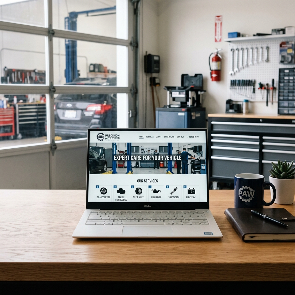
10 Real Auto Repair Shop Website Examples (With Takeaways)
1. Christian Brothers Automotive – Best for First-Time Visitors
Christian Brothers Automotive operates over 250 locations across the U.S., and their website reflects exactly what a first-time visitor needs: instant clarity. Within seconds, you know what they fix, where they are, and how to book.
The homepage leads with a location finder front and center. Instead of burying it in the nav, they make it the first action a visitor can take. This removes the most common friction point for someone searching "auto repair near me" — figuring out whether the shop even serves their area.
They pair that with a clean headline that speaks to trust, not just service. Words like "courtesy" and "nice" appear throughout. For a new customer nervous about being overcharged or oversold, this language does real work.
First-time visitors decide within 8 seconds whether to stay or leave. A visible location finder and a trust-focused headline do more than any fancy design.
What they get right:
- Location finder is the hero element — not a photo, not a tagline
- Service menu is one click away from the homepage
- Clear online booking CTA visible without scrolling
- Trust badges (ASE certifications, warranty info) appear early in the page hierarchy
2. Firestone Complete Auto Care – Best for Mobile Conversion
Firestone's mobile site is built like a conversion machine. The tap-to-call button is pinned to the top of the screen. The booking flow takes three steps. Navigation collapses into a clean hamburger menu that doesn't fight for space with the CTAs.
According to, 78% of local mobile searches result in an offline purchase within 24 hours. Firestone's mobile experience is designed to capture that intent before it evaporates.
Their service pages load fast on mobile and strip out visual clutter that slows things down on cellular connections. Images are compressed. Text is large enough to read without zooming. Forms ask for the minimum required information.
The best mobile auto repair sites don't shrink a desktop experience — they rebuild the experience around a thumb and a 4-inch screen.
What they get right:
- Persistent tap-to-call button throughout the entire browsing session
- Booking form collapsed to three fields on mobile
- Service pages under 2 seconds load time on LTE
- Location-aware prompts that pull up the nearest store automatically
3. Midas – Best Use of Customer Reviews
Midas integrates reviews directly into individual service pages, not just on a standalone testimonials page that no one finds. A customer landing on their brake service page sees star ratings and written reviews specific to brake work. That context matters.
Review count builds credibility. According to, 93% of consumers say online reviews impact their purchasing decisions. Midas doesn't hide their reviews — they surface them exactly where buying decisions happen.
They also display their aggregate rating in the browser tab title on some pages, which increases click-through rates from search results. It's a small detail with measurable impact.
Reviews placed on service pages convert better than reviews on a dedicated testimonials page. People want to see what others say about the specific job they need done.
What they get right:
- Reviews embedded on service pages, not siloed in one location
- Star ratings visible in Google search snippets via structured data markup
- Reviewer names and dates displayed for authenticity
- High review volume (thousands per location) used as a trust signal
4. Jiffy Lube – Best Service Page Structure
Jiffy Lube's service pages follow a formula that works for both search engines and real customers. Each page starts with a plain-language explanation of what the service is, moves into why it matters, then answers common questions before ending with a booking CTA.
The FAQ sections on their pages are built around the questions people actually type into Google — "how often should I get an oil change," "what happens if I don't change my oil." This pulls in long-tail search traffic and keeps visitors on the page longer.
Pricing hints appear without hard commitments. Phrases like "starting at" give customers a reference point without locking the shop in. This reduces the hesitation that comes from not knowing what something will cost before calling.
A good service page does three jobs: ranks in search, answers the customer's questions, and hands them a clear next step. Most shop pages do one of those three.
What they get right:
- H1, H2, and H3 headers follow a logical hierarchy for both readers and crawlers
- FAQs are written in the exact language customers search
- Pricing language manages expectations without eliminating flexibility
- A single, repeated CTA ("Find a Jiffy Lube") closes every section
5. Valvoline Instant Oil Change – Best Local SEO Integration
Valvoline runs hundreds of location pages, and each one is built to rank for hyper-local searches like "oil change [city name]" or "auto service near [neighborhood]." The pages aren't copies of each other — they include unique hours, phone numbers, photos, and sometimes local staff names.
Each location page embeds a Google Map, which signals geographic relevance to search engines and helps customers get directions without leaving the site. Schema markup (structured data that tells Google what type of business this is and where) is implemented correctly across all locations.
, consistent NAP (name, address, phone number) across location pages and citations is one of the top local ranking factors. Valvoline's pages nail this consistency while still feeling locally relevant.
One generic contact page won't rank locally. Each location needs its own page with unique, accurate details — that's what local SEO is built on.
What they get right:
- Dedicated URL for each location (e.g., /locations/houston-memorial)
- Embedded Google Maps on every location page
- Structured data markup for LocalBusiness schema
- Unique content per
1. [Shop Name] – Best for First-Time Visitors
Christian Brothers Automotive knows exactly who walks through its virtual door first: someone who's never used them before and isn't sure they can be trusted.
The homepage leads with a clean, reassuring headline — "Neighborhood Friendly, Nationally Known" — that does two things at once. It signals local familiarity and brand credibility before a visitor has scrolled an inch.
What They Get Right
The site earns trust fast through a combination of elements that first-time visitors actually care about:
- Prominent AAA approval badge above the fold — a third-party signal that removes doubt instantly
- Service area displayed clearly so visitors confirm within seconds that they're in the right place
- Star ratings and review count visible on the homepage, not buried on a separate testimonials page
- A single, bold CTA — "Schedule an Appointment" — that appears before any scrolling is required
- Warranty information front and center: their 3-year/36,000-mile guarantee is mentioned early, which directly reduces price anxiety
The navigation is simple. Services, locations, and booking are all reachable in one click. There's no guessing.
According to, 98% of consumers read online reviews for local businesses — and 46% say they need at least a 4-star rating before they'll consider contacting a shop. Christian Brothers meets that bar visibly and immediately.
Service Area Clarity Done Well
| Element | What It Does for First-Time Visitors |
|---|---|
| Location finder on homepage | Confirms the shop serves their neighborhood |
| "Find a Location" CTA | Removes friction for multi-location visitors |
| Consistent branding across all locations | Builds confidence through familiarity |
| AAA badge | Provides instant third-party validation |
The Takeaway
The best auto repair websites for first-time visitors don't ask visitors to figure out if they're in the right place — they confirm it within the first three seconds.
In practice, the most conversion-ready homepage for a new visitor answers three questions before they scroll: Who are you? Do you serve my area? Can I trust you? Christian Brothers answers all three on load.
If you're building your own shop website, lead with your service area, your strongest trust signal (certification, warranty, or review count), and one clear action. The goal isn't to impress — it's to reassure.
2. [Shop Name] – Best for Mobile Conversion
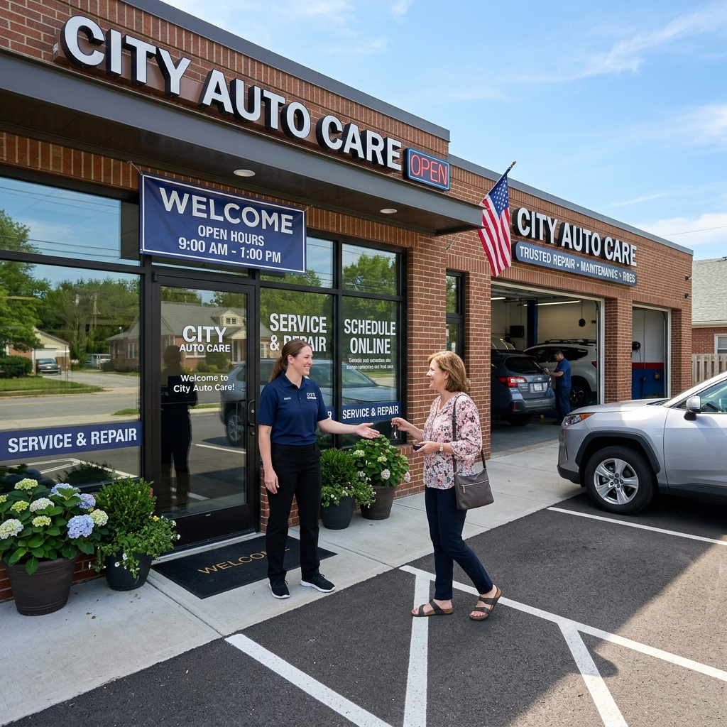
Midas runs one of the most mobile-optimized auto repair websites in the industry — and it's not by accident. With thousands of locations and millions of monthly searches happening on phones, Midas built its mobile experience to convert, not just display.
What They Got Right on Mobile
The moment you land on the Midas site from a phone, three things happen fast: you see a clear headline, a tap-to-call button sits at the top of the screen, and a "Find a Location" prompt appears before you have to scroll. There's no cluttered nav menu to fight through.
According to Google,. Midas keeps load times tight by using compressed images, minimal third-party scripts, and a stripped-back mobile layout that prioritizes action over aesthetics.
The booking flow on mobile is worth studying closely. It takes fewer than four taps to go from the homepage to a confirmed appointment. The form fields are large enough to use with a thumb, the keyboard doesn't cover the submit button, and location detection pre-fills the nearest shop. These small details compound into a meaningfully higher conversion rate.
Mobile UX Elements to Borrow
- Sticky tap-to-call bar fixed at the top or bottom of every page
- Single-column layout that never requires horizontal scrolling
- Auto-detecting location to reduce form friction
- Compressed images that load quickly on cellular networks
- Minimal navigation with only 3–4 top-level menu items on mobile
Roughly 60% of auto service searches now happen on mobile devices. If your website isn't built for thumbs first, you're losing customers before they even read your services list.
The Takeaway
The gap between a mobile-friendly site and a mobile-optimized site is conversion rate. Mobile-friendly means it doesn't break on a phone. Mobile-optimized means it's faster, simpler, and easier to act on than the desktop version. Midas treats mobile as its primary channel, not an afterthought.
A platform like RedAppy builds this thinking into its branded websites from the start — tap-to-call, fast load, and online booking that works cleanly on any screen size without requiring a separate mobile build.
Conclusion
A great auto repair website doesn't just look good — it works. The best examples in this article prove that design choices, content structure, and operational tools all shape whether a visitor books an appointment or clicks away.
The shops that consistently win online share three things: they build trust fast, they make it easy to take action, and they connect their website to the way their shop actually runs. That last part is what separates a brochure site from a business tool.
The gap between a website that exists and one that generates revenue comes down to one question: can a visitor find what they need and book within 60 seconds?
Most shops fail not because their site looks bad, but because it's disconnected. The booking form doesn't sync with the schedule. The service menu hasn't been updated in two years. The phone number isn't clickable on mobile. These aren't design problems — they're operational ones.
That's where a platform like RedAppy changes the equation. Every subscription includes a professional, branded website that connects directly to digital inspections, estimates, invoicing, and parts ordering. There's no gap between what a customer sees online and what happens inside the shop. The website becomes an active part of the workflow, not an afterthought.
Here's what to focus on as you evaluate or build your own site:
- Start with mobile. More than 60% of local search traffic comes from phones. If your site isn't fast and tap-friendly, you're losing customers before they read a word.
- Lead with trust. Reviews, certifications, and real photos of your team and shop do more than any tagline.
- Make booking frictionless. Every extra step in the booking flow costs you conversions. The best sites get it done in three clicks or fewer.
- Connect your tools. A website that feeds directly into your shop management system saves admin hours and prevents the errors that come from manual data entry.
- Keep content current. Outdated service menus and missing hours are among the most common reasons visitors leave without calling.
The shops featured here — from Christian Brothers Automotive's trust-first homepage to a RedAppy-powered site that ties the entire customer journey together — show what's possible when a website is built with purpose. You don't need a massive budget. You need the right structure, the right tools, and a clear understanding of what your customer needs to feel confident picking up the phone.
Start with one improvement this week. Add a click-to-call button. Update your service pages. Connect your booking system to your schedule. Small changes compound quickly, and in a competitive local market, the shop with the better website almost always wins the call.
Frequently Asked Questions
What is the $3000 rule for car repairs?
If a repair costs more than $3,000, you should seriously consider whether it's worth fixing the vehicle versus replacing it. The rule suggests comparing the repair cost to the car's current market value — if the repair exceeds the car's worth or approaches it, buying a new or used vehicle is typically the smarter financial decision.
What are some of the best automotive websites?
Top automotive websites include AutoTrader, Cars.com, Edmunds, and Kelley Blue Book for buying and valuing vehicles. For repair information and DIY guidance, sites like ALLDATA, RepairPal, and AutoZone's repair help section are widely trusted by both professionals and car owners.
Can I use Alldata for free?
ALLDATA does not offer a completely free version of its professional repair database. However, ALLDATA DIY offers a free 5-day trial, after which a paid subscription is required to access OEM repair procedures, wiring diagrams, and technical service bulletins.
What is a free website for car repair?
RepairPal.com is a popular free resource that provides repair cost estimates, shop locators, and general maintenance guidance. Other free options include AutoZone's Repair Help section and iATN's public resources, which offer diagnostic tips, repair guides, and community-sourced advice for common vehicle issues.
Ready to Transform Your Shop?
RedAppy helps auto repair shops create professional digital estimates with photos and videos, send them instantly via text or email, and get customer approvals in seconds. No credit card required to start.