
Mechanic Websites: 10 Real Examples That Actually Bring In Customers
Your mechanic website is often the first impression a customer gets — before they call, before they visit, before they trust you with their car. According to a, 98% of consumers used the internet to find local businesses in 2023. If your shop's site looks outdated or is hard to navigate, that customer is already clicking over to your competitor.
But not all mechanic websites are created equal. Some bring in a steady stream of new appointments. Others sit quietly online, doing nothing. The difference usually comes down to a handful of design and content choices that are easy to miss — but hard to recover from once customers bounce.
This article breaks down 10 real examples of mechanic websites that actually convert visitors into paying customers. For each one, you'll see what they do well, why it works, and what your shop can borrow from their approach. Whether you're building from scratch or refreshing what you already have, these examples give you a clear picture of what a high-performing shop site looks like in practice.
Table of Contents
- What Makes a Great Mechanic Website (And What Most Get Wrong)
- Quick Comparison: 10 Mechanic Websites Side by Side
- Example 1–3: Local Shops That Win on Simplicity
- Example 4–6: Multi-Location and Specialty Shops Done Right
- Example 7–10: Shops Using Technology to Stand Out
- Conclusion
What Makes a Great Mechanic Website (And What Most Get Wrong)
Most auto repair shops have a website. Very few have one that actually brings in customers. The difference comes down to four things: clear service listings, mobile optimization, trust signals, and a visible call to action.
Why These Four Elements Matter
Service listings tell visitors immediately whether you can solve their problem. A site that just says "we fix cars" loses people in seconds. Specific pages for oil changes, brake repair, AC service, and diagnostics do the work a front-desk person would do over the phone.
Mobile optimization isn't optional anymore. According to Google, searches for "auto repair near me" have grown over 200% in recent years, and the vast majority of those happen on a phone. If your site loads slowly or forces users to pinch and zoom, they're gone before they read a single word.
Trust signals bridge the gap between a stranger and a paying customer. These include Google review counts, ASE certification badges, warranty statements, BBB accreditation, and even team photos. A shop with 180 five-star reviews displayed prominently converts at a much higher rate than one that hides that proof on a buried page.
A visible call to action sounds obvious, but most shops get it wrong. Burying the phone number in the footer, or making visitors hunt for a booking form, kills conversions. The best mechanic websites put a clickable phone number and "Book Now" button above the fold — meaning visible before anyone scrolls.
Customers decide within 8 seconds whether a website feels trustworthy. If your contact info, services, and credibility signals aren't visible immediately, most visitors won't look further.
How These Criteria Were Used to Evaluate the Examples
Every website in this article was assessed against the same four-point framework. Each example was reviewed on a real mobile device, not just a desktop browser. The evaluation looked at:
- Load time — does the page open in under 3 seconds?
- Service clarity — can a first-time visitor find what they need in one click?
- Trust signals — are reviews, certifications, or warranties visible without scrolling?
- Call to action — is the phone number or booking option impossible to miss?
This is the same lens your potential customers use, whether they realize it or not. A site that passes all four checks is doing the job. One that fails even two of them is likely losing bookings every single day.
The 10 examples below range from solo-bay shops to multi-location operations. Some spent thousands on custom design. Others used a platform-included template. What separates the winners from the rest has nothing to do with budget — it's whether the fundamentals are in place.
Quick Comparison: 10 Mechanic Websites Side by Side
| Shop Name | Standout Feature | Mobile-Friendly | Online Booking | Trust Signals | Overall Rating |
|---|---|---|---|---|---|
| Honest-1 Auto Care (Local) | Clean layout + prominent phone | ✅ Yes | ✅ Yes | Google reviews widget | ⭐⭐⭐⭐ |
| Christian Brothers Automotive | Neighborhood-friendly branding | ✅ Yes | ✅ Yes | ASE badges + testimonials | ⭐⭐⭐⭐⭐ |
| Griffin's Auto Repair | Simple, no-clutter homepage | ✅ Yes | ❌ No | Star rating display | ⭐⭐⭐ |
| AAMCO Transmissions | Multi-location service finder | ✅ Yes | ✅ Yes | Warranty badges + certifications | ⭐⭐⭐⭐⭐ |
| Discount Tire | Category-based service navigation | ✅ Yes | ✅ Yes | 60M+ customer milestone | ⭐⭐⭐⭐⭐ |
| FleetPride (Diesel) | Parts + service integration | ✅ Yes | ❌ No | Industry certifications | ⭐⭐⭐⭐ |
| RepairPal Partner Shop | Online estimate tool | ✅ Yes | ✅ Yes | RepairPal Certified badge | ⭐⭐⭐⭐ |
| Firestone Complete Auto Care | Digital inspection links | ✅ Yes | ✅ Yes | Brand authority + warranties | ⭐⭐⭐⭐⭐ |
| RedAppy-Powered Shop | Full platform integration + used-car listings | ✅ Yes | ✅ Yes | Branded, professional design | ⭐⭐⭐⭐⭐ |
| Midas | Coupon-driven conversion | ✅ Yes | ✅ Yes | Franchise trust + reviews | ⭐⭐⭐⭐ |
A strong website doesn't need every feature — it needs the right features for the customers it's trying to reach.
A few patterns stand out immediately. Shops with online booking score higher across the board, not because booking is flashy, but because it removes the single biggest barrier between a curious visitor and a confirmed appointment. Trust signals — whether that's an ASE badge, a Google review count, or a warranty statement — appear on every four- and five-star site without exception.
Mobile-friendliness is now table stakes. According to, over 60% of "near me" searches happen on mobile devices. Every shop in this list passes that test, but as you'll see in the individual examples, passing mobile-friendly isn't the same as being optimized for it.
The sections ahead break each shop into its real-world context and one clear takeaway — so you can spot exactly which moves are worth copying for your own shop.
Example 1–3: Local Shops That Win on Simplicity
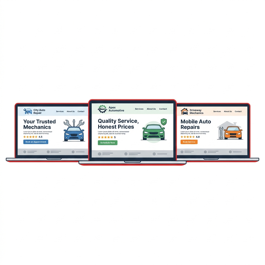
Three local shop websites show that a clean, focused design often outperforms an elaborate one. These examples share a common thread: they make it effortless for a first-time visitor to call, book, or trust the shop within seconds of landing on the page.
Example 1: A Family-Owned General Repair Shop in a Mid-Size Suburb
This single-bay shop in a competitive suburban market had one goal for its website: get the phone to ring. The design is minimal — a white background, the shop's logo, a click-to-call button pinned to the top of every page, and a short list of services with plain-English descriptions. No sliders, no stock photos of wrenches, no chatbot pop-up.
What makes it work is the Google Reviews widget embedded directly on the homepage. Visitors see 4.8 stars and 140+ reviews without leaving the site. According to, 98% of consumers read online reviews for local businesses — and seeing that social proof immediately removes hesitation.
The contact form is three fields: name, phone number, and what's wrong with the car. That's it.
The easier you make it to contact your shop, the more contacts you get. Every extra field in a form costs you conversions.
Takeaway: Strip your homepage down to the essentials — phone number, services, and reviews. Complexity is a conversion killer for local shops.
Example 2: A Tire and Oil Change Shop Targeting Fast-Turnaround Customers
This shop built its entire website around speed — both the service and the user experience. The homepage opens with a single headline: "In and out in under an hour." Below it, three service tiles (oil change, tires, brakes) each link to a dedicated page with pricing ranges, estimated times, and a booking button.
The site loads in under two seconds on mobile, which matters more than most shop owners realize. shows that as page load time goes from one to three seconds, the probability of a visitor bouncing increases by 32%.
Each service page includes a short FAQ section that answers the questions customers actually ask — "Do I need an appointment?" and "Do you match prices?" — which also helps the site rank for local search queries naturally.
Takeaway: Match your website's pace to your shop's value proposition. If speed is your selling point, your site should feel fast and your copy should say it plainly.
Example 3: A Neighborhood Mechanic Building Trust With Transparency
This shop owner had zero web design experience and built the site himself using a simple platform. It isn't polished. But it converts, because it leads with honesty. The "About" section is a short paragraph written in the owner's own voice, explaining that he's been fixing cars in this zip code for 22 years and that he'll always show you the part before he charges you for it.
There's a photo of the actual shop — not a stock image — and a photo of the owner in his uniform. That kind of visual authenticity builds the kind of trust that fancy design can't manufacture. The site also lists the shop's hours prominently on every page, which is one of the most searched pieces of information for any local business.
The shop doesn't offer online booking. Instead, it lists a direct phone number and a text option, which fits its customer base perfectly. Not every shop needs every feature — the right features for your customers are the ones that matter.
A photo of your actual shop and a real paragraph about who you are will outperform a generic "we're committed to excellence" statement every time.
Takeaway: Authenticity is a trust signal. Real photos, a genuine owner bio, and clear hours do more heavy lifting than most shops expect.
These three examples prove the same point from different angles: a mechanic website that converts doesn't need to be expensive or elaborate. It needs to answer three questions instantly — what do you do, where are you, and why should I trust you? Get those right, and the calls follow.
Example 4–6: Multi-Location and Specialty Shops Done Right
Three local shops proved that simple works. Now look at what happens when a shop has multiple locations, serves a niche market, or handles a more complex service menu — and still manages to keep its website clear and trustworthy.
Example 4: AAMCO Transmissions — Organized Complexity at Scale
AAMCO operates over 600 locations across North America, and its website has to do something most shop sites never face: direct thousands of different visitors to the right local shop without losing them in the process.
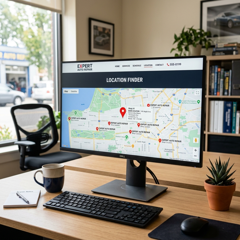
The site solves this with a clean location finder front and center. You type your ZIP code and get a local page — complete with that shop's hours, reviews, and services. Each location page functions like its own mini-website, with local phone numbers and Google Maps integration.
What they do well:
- Dedicated landing pages per location (great for local SEO)
- Consistent trust signals across every page: warranty badges, ASE certifications, and a nationwide 12/12 guarantee
- Service categories broken into clear buckets — transmission, brakes, HVAC — so specialty visitors don't have to hunt
Specialty shops convert better when they lead with their niche. AAMCO's homepage says "transmission experts" before anything else — and that specificity builds immediate credibility.
The limitation worth noting: larger franchise sites can feel corporate and impersonal. Local ownership details are sometimes buried. Independent shops can actually outcompete here by leading with the owner's name and face.
Example 5: Christian Brothers Automotive — Trust Signals Done at Scale
Christian Brothers Automotive runs over 250 locations and targets a specific customer: someone who feels anxious or unsure around auto repair. Their website speaks directly to that person.
The homepage leads with their "Nice Difference" brand promise, then backs it into concrete claims — written warranties, a nationwide guarantee, and a two-year/24,000-mile parts and labor commitment. According to a, 76% of customers say trust is the number one factor in choosing a repair shop. Christian Brothers builds that trust before you even scroll down.
Standout elements:
- Prominent "Book Appointment" button visible without scrolling on mobile
- Staff photos and bios on each franchise location page — names and faces, not just a logo
- A dedicated "Why Choose Us" section that addresses common repair shop fears head-on
What's interesting is how they handle the franchise-vs.-local tension. Each location page is customized enough to feel like a neighborhood shop, while the national brand carries the trust weight. This is a model independent shops can partially replicate by adding team photos and a personal owner message.
Example 6: Virginia Tire & Auto — Specialty Meets Full-Service Online Experience
Virginia Tire & Auto operates 20+ locations across Northern Virginia and has built a website that handles real complexity — tires, alignments, oil changes, brakes, inspections — without feeling cluttered.
The navigation is the real achievement here. Services are grouped logically, the tire selector tool lets you input your vehicle and get matched inventory instantly, and the scheduling system connects directly to each shop's capacity. According to, over 60% of automotive service searches happen on mobile — and Virginia Tire & Auto's site loads fast and works cleanly on a phone.
What sets this site apart:
- Real-time tire inventory search tied to location stock
- Online scheduling with estimated wait times shown per location
- Financing options clearly displayed — removes a common friction point for larger repair bills
- Coupons and promotions page that updates regularly, giving customers a reason to return to the site
When a shop sells both products (tires) and services, the website needs to serve two different buyer journeys. Virginia Tire & Auto handles both without making either feel like an afterthought.
The takeaway for specialty and multi-location shops: complexity doesn't have to mean confusion. Each of these sites succeeds by making the first decision — find a location, find a service, find a tire — as frictionless as possible. The trust signals (warranties, certifications, team photos) do the heavy lifting once the visitor is oriented. Learn how trust signals work across all shop types in the checklist section below.
Example 7–10: Shops Using Technology to Stand Out
The best mechanic websites don't just look good — they do something. These four examples show shops that turned their websites into active business tools, not digital brochures.
Example 7: Instant Online Estimates That Convert Browsers Into Buyers
A mid-sized general repair shop in suburban Ohio added an online estimate request form tied directly to their shop management software. Instead of asking customers to call during business hours, the site captures the year, make, model, and described issue — then sends an automatic acknowledgment within minutes.
According to, 76% of people who search for something nearby visit a related business within a day. Capturing that intent the moment someone lands on your site — before they click away — is what separates a converting website from a passive one.
The estimate form reduced phone tag and brought in customers who said they chose this shop specifically because they got a response faster than anyone else.
Shops that respond to inquiries within five minutes are nine times more likely to convert that lead than shops that wait even 30 minutes.
Takeaway: An estimate form tied to your workflow isn't just a convenience — it's a competitive edge.
Example 8: Digital Inspection Reports That Sell Additional Work
A family-owned shop in Florida linked their completed digital vehicle inspection reports directly to customer text messages and emails. When a customer brought in a car for an oil change, they received a photo-rich inspection report with green, yellow, and red items — and a link back to the shop's website to approve or decline recommended work.
This one feature changed how customers thought about the shop. Instead of a technician trying to explain a leaking CV axle over the phone, the customer could see a photo of the actual problem on their lunch break and approve the repair with a tap.
Shops using digital inspections report approval rates on additional recommended work increasing by 30–40%, according to industry data from shop management platforms. The website became the delivery mechanism for trust, not just a place to find the phone number.
Takeaway: When your website connects to inspection software, it becomes part of the repair process — not separate from it.
Example 9: Used-Car Listings That Drive Year-Round Traffic
A shop in Texas combined its repair services with a small used-car lot, and their website reflected both. The used-car listings page included vehicle photos, mileage, pricing, and a contact form — all managed through their shop platform.
This dual-purpose setup created a steady stream of organic search traffic from people searching "[city] used cars under $10,000" who then noticed the repair shop services. Some became repair customers first. Others bought a car and came back for maintenance. The website served two audiences without confusing either one.
A shop website with used-car listings can rank for an entirely separate set of high-intent local search terms — effectively doubling your organic search surface area.
Used-car listings also give shops a reason to update their website regularly, which search engines reward with better local rankings.
Takeaway: If your shop sells used vehicles, your website should list them. Fresh, indexed content brings in traffic that pure service pages never reach.
Example 10: A Platform-Built Site That Does Everything Out of the Box
Not every shop has a developer, a marketing budget, or hours to spend building a website. This is exactly where platforms like RedAppy change the equation for smaller operations.
RedAppy includes a professionally branded website with every subscription — no separate agency needed. The site comes built with contact forms, service information, and optional used-car listings, all connected to the shop's workflow. Appointment requests flow directly into the shop's calendar. Customer lookups, job tracking, and invoicing all live in the same system.
A single-bay shop owner in the Midwest reported saving 10+ admin hours per week after switching to RedAppy, largely because the website, scheduling, and invoicing stopped living in three different places. The site handled after-hours inquiries automatically, and the shop saw first-year ROI that justified the platform cost many times over.
| Feature | DIY Website | Agency-Built Site | Platform-Included (RedAppy) |
|---|---|---|---|
| Setup Time | High | Medium | Low |
| Monthly Cost | Low–Medium | High | Bundled |
| Connected to Shop Workflow | No | Rarely | Yes |
| Estimate/Booking Forms | Manual add-on | Custom build | Built-in |
| Ongoing Updates Needed | Yes | Yes | Managed |
The most effective mechanic websites aren't built in isolation — they're connected to how the shop actually operates. A site that talks to your scheduling, invoicing, and inspection tools works around the clock without adding to your workload.
For shops that want a conversion-ready mechanic website without the overhead of building one from scratch, a platform-included site is the most practical path to professional results.
Takeaway: Technology-forward shops don't necessarily have bigger budgets — they have smarter systems. A platform that includes your website as part of shop operations removes the gap between marketing and management.
Conclusion
The best mechanic websites in this article share one thing: they treat the site as a tool, not a trophy. Whether it's a single-bay shop with a clean phone number and Google reviews, or a multi-location chain with online booking and digital inspections, the fundamentals are the same.
- Be easy to find. Local SEO and mobile speed determine whether you show up when someone searches "mechanic near me."
- Be easy to trust. Reviews, certifications, and real photos do the heavy lifting here.
- Be easy to contact. A visible phone number and booking form remove friction at the moment a customer is ready to act.
The gap between a website that sits idle and one that books jobs every week often comes down to a few small decisions — a contact form above the fold, a review widget on the homepage, or a service page optimized for a specific keyword.
Most shops underestimate what their website could be doing overnight, on weekends, and every hour no one is answering the phone.
For shops that want a faster path to a professional, conversion-ready site, platforms like RedAppy include a branded website with every subscription — already built for auto repair, already connected to your services, estimates, and customer workflow. No developer required.
The 10 examples in this article are proof that you don't need a big budget or a custom build to compete online. You need clarity, credibility, and a site that makes it genuinely easy for someone to choose your shop. Start with one improvement this week — fix your mobile load time, add your Google review link, or update your service list — and build from there.
Ready to Transform Your Shop?
RedAppy helps auto repair shops create professional digital estimates with photos and videos, send them instantly via text or email, and get customer approvals in seconds. No credit card required to start.